Tabular Reports
Tabular reports are similar to tables, but they are more customizable.
There are two types of tabular reports. By row and standard (by column).
They can be created from the menu entry ADMIN->Dashboards->Tabular Reports.
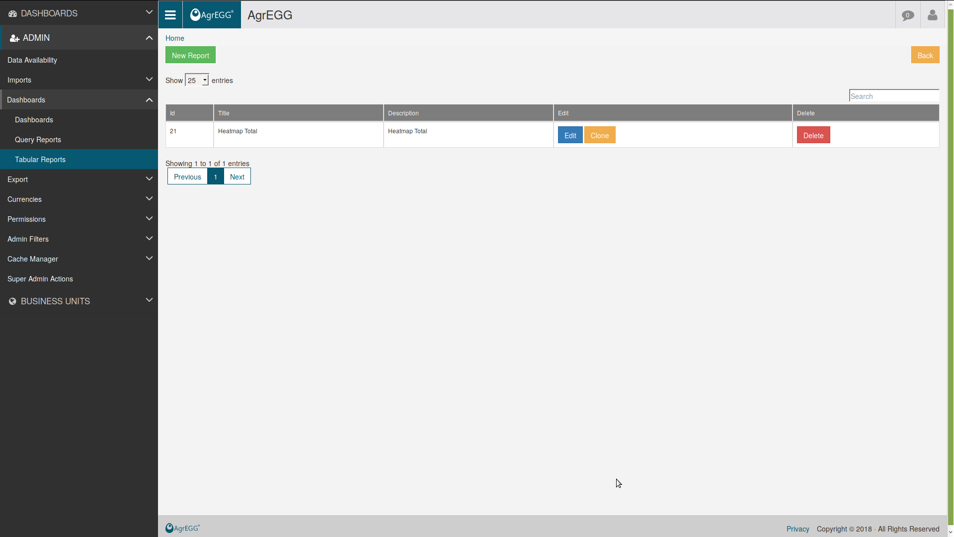
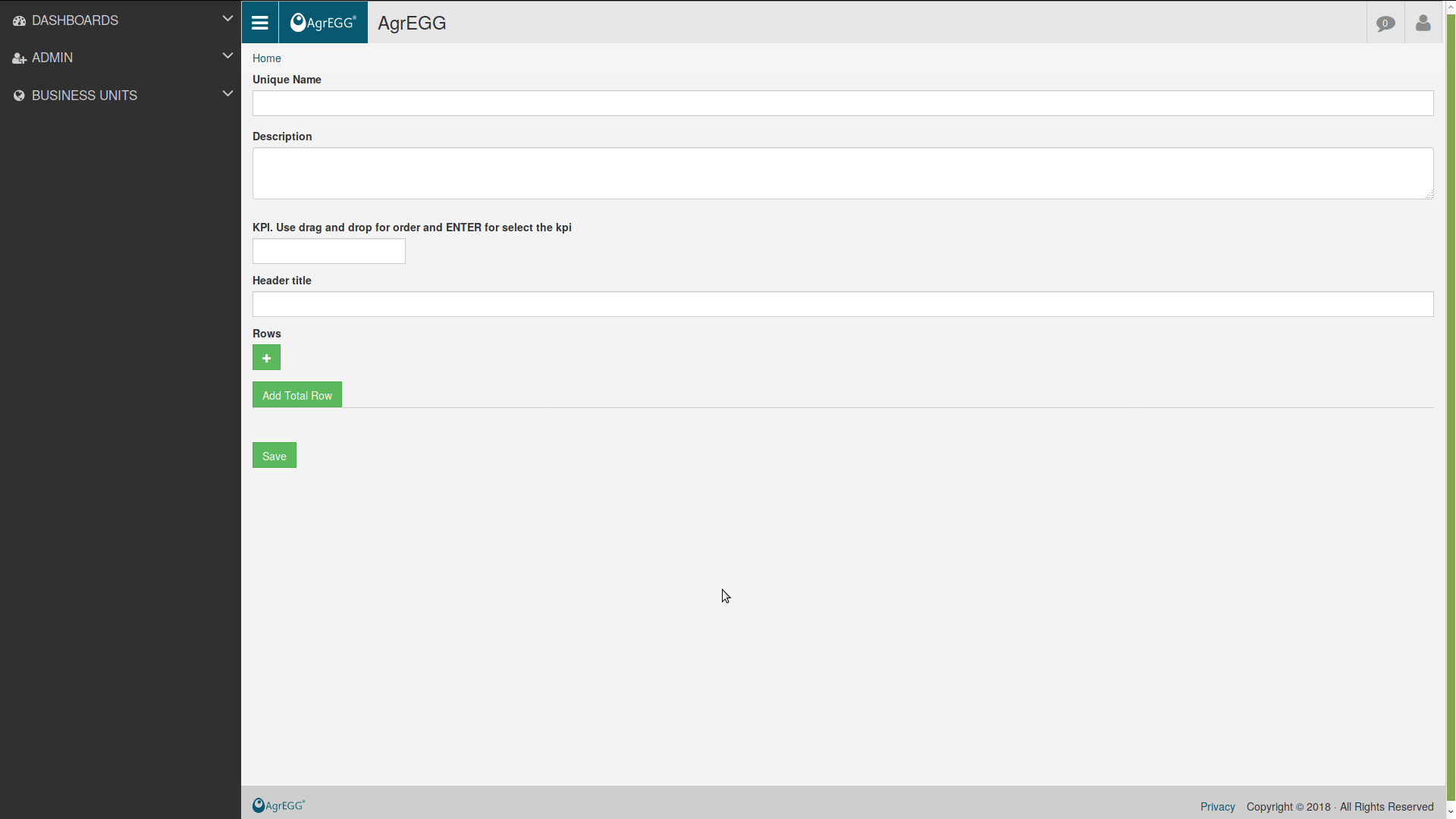
Then select “New Report” to create a new report.
Or you can edit an existing one.
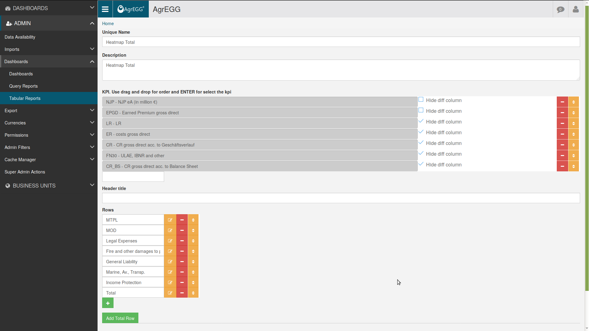
Insert the parameters in the configuration screen.
- Unique Name: insert the identifying name of the table report.
- Description: insert a brief description of the table.
- Generic filters limited by menu filters: allow the user to filter to filter the tabular report with the right menus filter. Please note that the generation will be slower-
- By Whom limited by menu filters: allow the user to filter to filter the tabular report with the right menu By Whom filter. The by whom level data access is always guaranteed
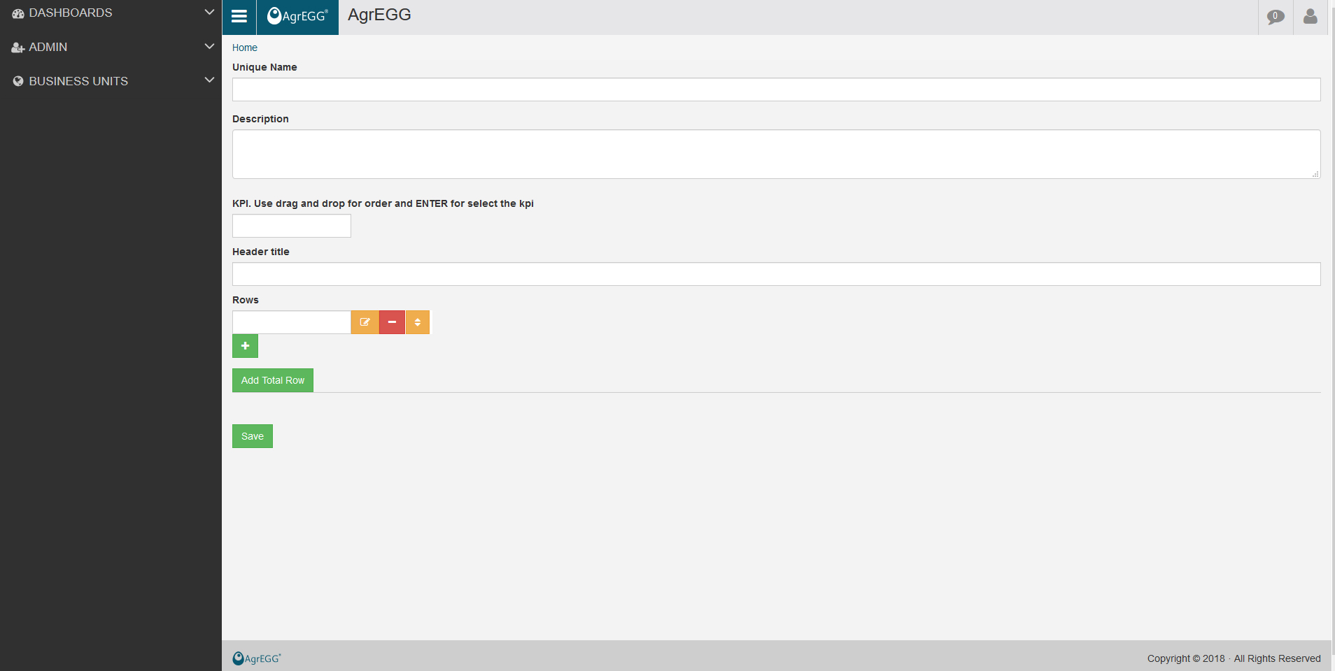
- KPI: insert the list of the KPIs to be shown in the table.
- Header Title: insert the title to be shown in the first row of the table.
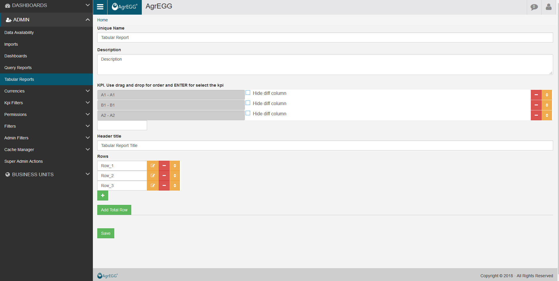
- Rows: insert the description of the row containing the filters needed for the analysis of the selected KPIs. It will be visible in the first column of the table.
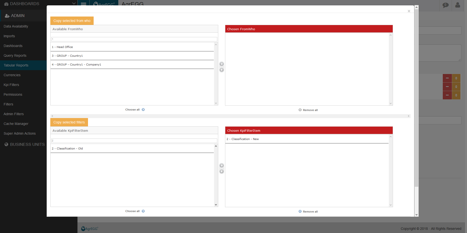
Clicking on the icon “Edit Rows” one enters the configuration screen where to select the aggregation level of the KPI for each row.
After saving, the new Tabular Report is available under the Dashboards menu.
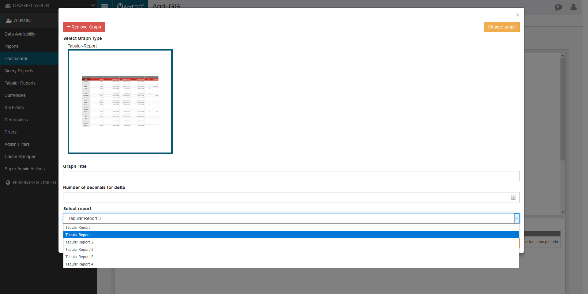
Tabular Reports Per Row
The tabular report per row allows you to enter one KPI per row and filter the rows
In the tabular report per row you can add the [FREE] special tag that allow the user to directly edit that row in the tabular report.
First of all edit the tabular report and add the [FREE] tag where is needed

Then in the dashboard generator under the tab “show extra option” select “show edit kpis” and save.
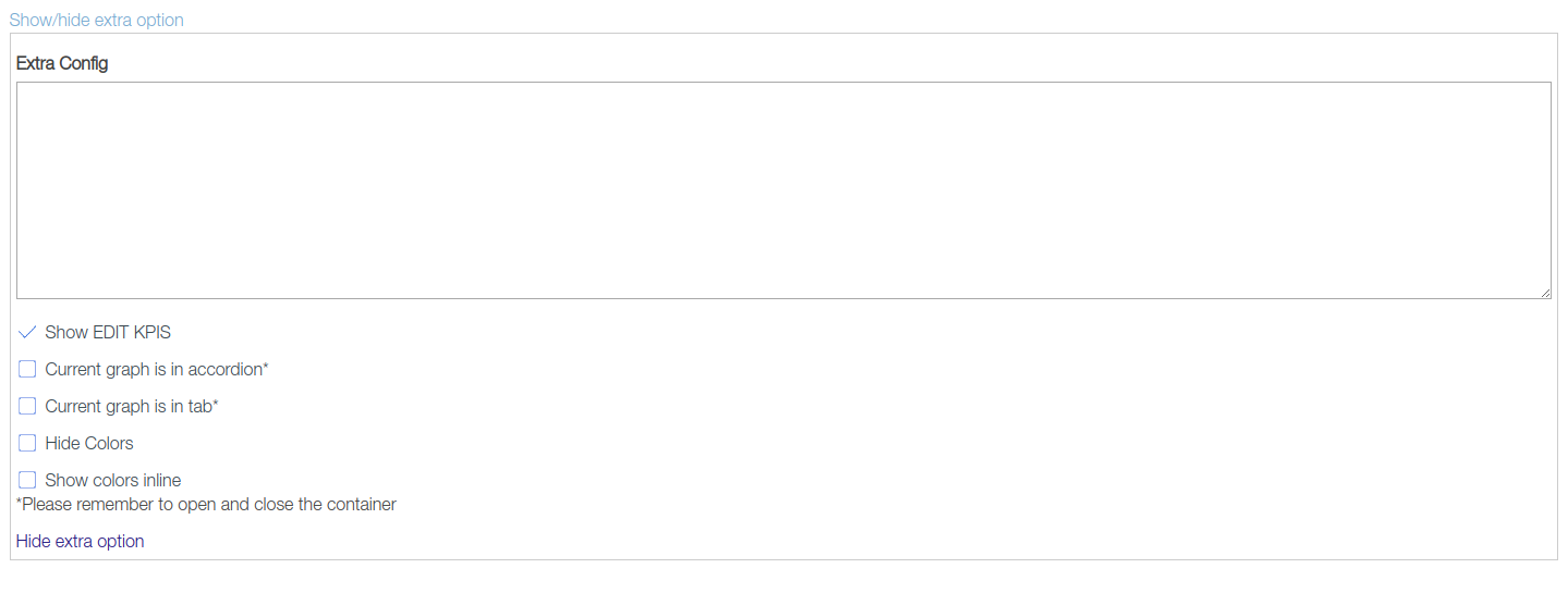
The user can easly edit the tabular report directly in the dashboard

If you click in the edit icon in each row you can select custom filter or set the output measure scale by inserting K or M or B
If you want to show balls insted of color the cell background in the extra config of the graph in dashboard generator you have to add the json config
{"show_balls": "true"}
or
{"show_traffic_lights": "true"}