Showing data in Dashboards
The fundamental use of Dashboards is to show data.
Roughly speaking, data can be represented in graphical or numerical format.
Plots
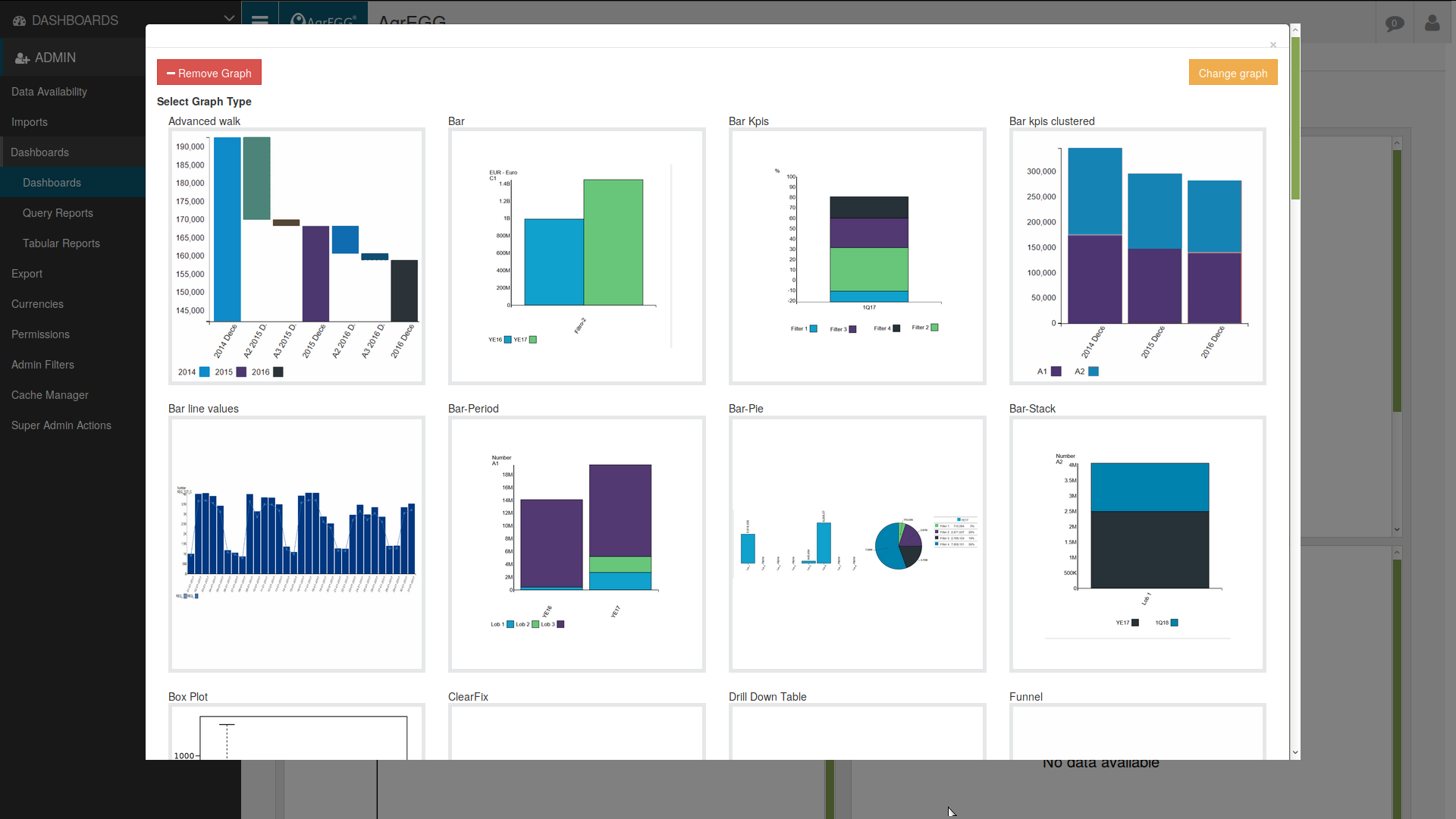
In the first case, we have plots. Plots included in AgrEGG are:
Bar, Bar Stack and Bar Period: shows data grouped by period, stacked or side by side. By clicking on a bar it is possible to drill down; by clicking on the background, to drill up.
Bar Kpis: allows the visualization of two different KPIs grouped by period.
Multiple Kpis lines: used to compare different KPIs, and to check if they influence each other.
Radar: used to visualize multivariate data in a bidimensional plot of three or more quantitative variables represented by axes stemming from the same central point. The relative position and the angles of these axes is usually uninformative.
Single Value: shows a single KPI value.
Line Bar: compares two KPIs using a line-and-bar plot.
Waterfall: shows the net effect of positive and negative values by different contributors to the cumulative value of a KPI for two consecutive periods.
Walk: allows the visualization of the difference in KPIs for different periods.
Line: shows the temporal evolution of a KPI.
Map: shows the KPI on a map. The bigger the circle the largest the value.
Pie: shows the partial contributions to a total. By clicking on a section it is possible to drill down, by clicking on the background to drill up.
Treemap: shows hierarchical data by connected rectangles.
Box Plot: shows schematically a distribution of data by its quartiles and the maximum and minimum of its values.
Bar-Pie: shows the same KPI on different hierarchical levels.
Tables
In the second case, we have tables. Tables included in AGrEGG are:
Table (Last Period): shows a KPI in a given period as a function of a parameter.
Tabular Report: report used for Heatmap Sample, configurable under the menu entry Tabular Report.
Table-LoBs: shows a KPI grouped by LoB (Line of Business) and period.
Table-Previous: several KPIs are compared to their value in a previous period.
Drill Down Table: shows a KPI in a table with enabled drilling-down.
More elaborated tables can be created via tabular reports and query reports.